Assignment 4: Bicycling Facilities in Delft – Lynda Nitka
In this assignment, we were given the task of observing the various types of bike path facilities that are designed around the city of Delft. These included bike lanes, cycle tracks, bicycle boulevards, advisory lanes, service roads, and bike highways. Even though these facilities all have different physical characteristics, they all have the same objective: to allow cyclists to travel to their destination safely and efficiently.
Facility: Bike Lanes
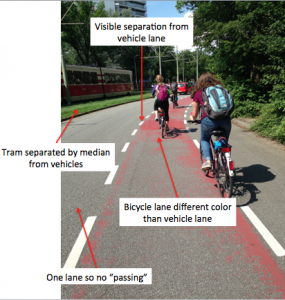
Figure 1: Bike lanes – Location 4 – Buitenhofdreef, Martinus Nijhoflaan
Bike lanes – Location 4 – Buitenhofdreef, Martinus Nijhoflaan: This facility provides safety and convenience because of the fact that the tram is physically separated from motor vehicles, cyclists, and pedestrians. This is important, since the tram would be the mode of transportation that is most likely to injure a person traveling via car, bicycle, or by walking. Additionally, this facility provides safety and convenience because of the fact that the bicycle lane is a different color than the vehicular travel lane. Although this visible separation is not as safe as physical separation, the visible separation is done well at this facility because of the fact that the engineer designed this facility with two forms of visible separation: pavement markings and varying colors of pavement. Lastly, since the vehicles are only provided one lane of travel, passing is not encouraged which is safer for cyclists. This is designed well because of the fact that cyclists, vehicles, and the tram are all either physically or visibly separated in some way. This facility does seem expensive, since the width of all of the travel lanes seems rather large compared to the other facilities.
Facility: Cycle Tracks
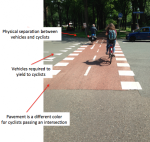
Figure 2: Cycle tracks – Location 5 – Voorhofdreef
Cycle tracks – Location 5 – Voorhofdreef: I thought that one of the best safety features of this facility was the fact that at intersections, cyclists are provided a different colored pavement than vehicles traveling along this roadway. In my opinion, this emphasized the fact that the cyclists had the right of way, along with the “shark teeth” pavement markings that vehicles have to yield at. I feel as though it is important to mention how cycle tracks address intersections, since cycle tracks already feel safe along the roadway because they are physically separated from vehicles, but I also thought that this facility was safe because of the fact that bicyclists were physically separated from the roadway. I believe that this facility was expensive because of the amount of the total room that all of the travel ways take up, but I think it was worth the money to build this facility being that I noticed a lot of traffic on this roadway.
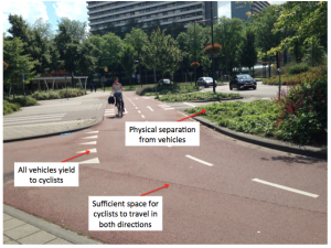
Figure 3: Cycle Tracks – Location 6 – Papsouwselaan
Cycle Tracks – Location 6 – Papsouwselaan: The most impressive part of this facility was the roundabout in my opinion. I felt really safe in the design of this roundabout because of the fact that all vehicles had to yield to the cyclists, and the cyclists had traffic signals whenever a tram came. Additionally, I found it important that pedestrians had the right of way before cyclists, since they are the most likely to get injured or killed in an accident. I thought that this was very well designed, since cyclists were physically separated from the vehicles and it did not seem like the engineer who designed this had a very limited amount of money. I feel as though two-way cycling roundabouts are rare, so the engineer who designed this roundabout really had to think about what mode of travel gets priority at which times. The amount of space required to install this roundabout seems like a lot, since pedestrians, cyclists, vehicles, and trams are all separate paths, which makes it safer.
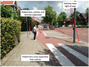
Figure 4: Cycle Tracks – Location 10 – Ruys de Beerenbrouckstraat
Cycle Tracks – Location 10 – Ruys de Beerenbrouckstraat: I felt very safe on this facility, mostly because each mode of transportation had their own travel way and did not have to worry about any opposing traffic. Vehicles and bicycles were physically separated, and the pedestrians and cyclists were also physically separated by the material of the travel way (brick versus pavement; gray versus red). I thought that the design of this roadway was unique as well, since the engineer who had designed this obviously had to worry about the residential housing on each side of the street. It seems as though the engineer who designed this facility really paid attention to using pavement markings as emphasis for which mode of travel must yield. Specifically, cyclists know to yield to pedestrians because of the crosswalk protruding into the bike lane, and bicycles also know to yield to vehicles because of the “shark’s teeth” pavement markings. Although this facility was probably expensive based on the total widths of the roadway, I think that the money used to implement this roadway was put to good use based on the amount of traffic that was noticed while traveling this facility. This was one of the only facilities that I measured the widths, and the allotted space for pedestrians was about 7.5 feet, for cyclists was 7 feet, and for cars was 10 feet, which seemed sufficient for each mode of travel.
Facility: Bike Boulevard
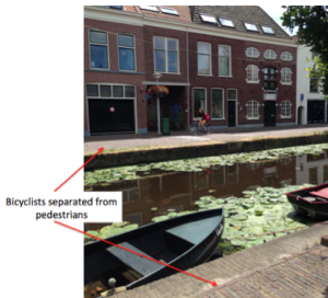
Figure 5: Bike boulevard – Location 7 – Buitenwatersloot
Bike boulevard – Location 7 – Buitenwatersloot: This facility was another facility that I felt extremely safe on, since very little motor vehicles were traveling on these paths. Additionally, the pedestrians and bicyclists were physically separated by an entire canal, which provided an additional factor of safety. I thought that the design of this roadway was unique and smart due to the fact that houses were along both sides of the travel paths, as well as a canal in the middle of the paths. Because of this, the engineer probably had a limited amount of space and money to create such a safe environment for travel, that was also extremely aesthetically pleasing.
Facility: Advisory Lanes
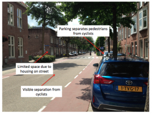
Figure 6: Advisory lanes – Location 8 – Hugo de Grootstraat
Advisory lanes – Location 8 – Hugo de Grootstraat: On this roadway, I felt safe mostly due to the fact that very little vehicles were driving along this roadway. This facility provided safety and convenience mostly to pedestrians, since they are the only ones that are physically separated from the other modes of transportation. However, cyclists are visibly separated from vehicles by pavement markings and the color of the pavement for each mode of travel, even though vehicles are also able to use the bicycle lanes for traveling since it is a two-way street. The engineer probably made the cycle lanes visibly separate from the vehicle travel way to make cyclists feel more comfortable. I believe that the engineer who designed this roadway did the best that they could with the limited amount of space provided between the two rows of housing. The engineer seemed to provide a sufficient width for the cyclists first, and then gave the remaining amount of roadway to vehicles. Additionally, this facility seems inexpensive because of the small amount of space of this facility compared to the other facilities.
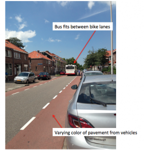
Figure 7: Advisory lanes – Location 9 – Adriaan Pauwstraat
Advisory lanes – Location 9 – Adriaan Pauwstraat: On this roadway, I felt as though the facility was as safe as could have possibly been, given that a good amount of the limited space between the houses was allotted to cyclists. This facility provides safety and convenience due to the fact that once again, all of the modes of transportation are visibly or physically separated from each other. I found it very interesting that vehicles are traveling both ways in the middle of this facility, even though the width of the vehicle lane is not wide enough for two vehicles. I also felt that pedestrians were given a disadvantage since it seemed as though vehicles were parking in their path of travel. I felt as though the engineer who designed this did the best with the space that he/she was given since the road is lined with housing on both sides, and the facility does not seem unreasonably expensive due to the fact that the total widths of the paths of travel are not as wide as some of the other facilities’.
Facility: Service Road
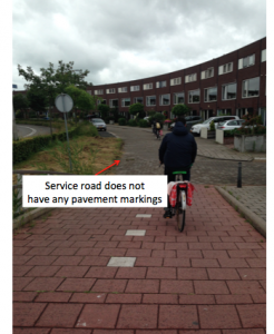
Figure 8: Service road – Location 13 – Zuidpoldersingel
Service road – Location 13 – Zuidpoldersingel: Although this facility did not have any pavement markings or physical or visible separation, I still felt very safe traveling on this roadway, being that there was little to no traffic on the service road. Furthermore, the one or two cars that I did notice on this service road were traveling at very low speeds, since the only reason for these roadways are for access to the housing on this street. I felt like these service roads did not require as much thought in design as other roadways, since really these roadways are just wide enough to provide a path of travel for all modes of transportation to access a short span of houses. The facilities seem relatively inexpensive, especially since there is no striping or separation between the modes of transportation.
Facility: Bike Highway
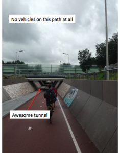
Figure 9: Bike highway – Location 14 N470 Bike Highway
Bike highway – Location 14 N470 Bike Highway: This facility was definitely the facility that I felt the most safe on. This was due to the fact that the cyclists had the right of way for such a long stretch of land. There were no pedestrians allowed when traveling this route, so I felt as though I was able to enjoy traveling along this path even more because of the low-stress environment. I feel as though this design was one of the best I had seen, since bicyclists were able to travel next to a major highway for vehicles and still feel completely safe. However, this facility did appear to be expensive based on the sufficient width for bicyclists as well as the length of the bicycle path.
