Assignment 4: Delft Bicycling Facilities: Kevin Jimenez
The following analysis focuses on several different types of bicycling infrastructure in the city of Delft, The Netherlands. Each type of bicycle infrastructure was ridden, photographed, and then reflected upon with specific attention paid to safety, how typical riders used the facility, space constraints and design challenges, and the relative expense of the facilities. Descriptions of the bicycling infrastructure are accompanied by figures below.
Bike Lanes
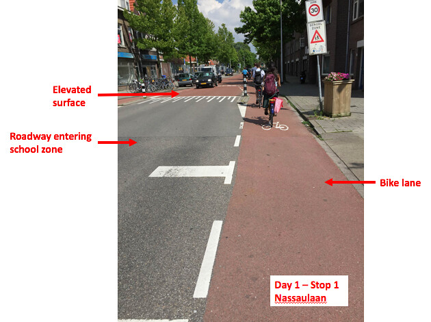
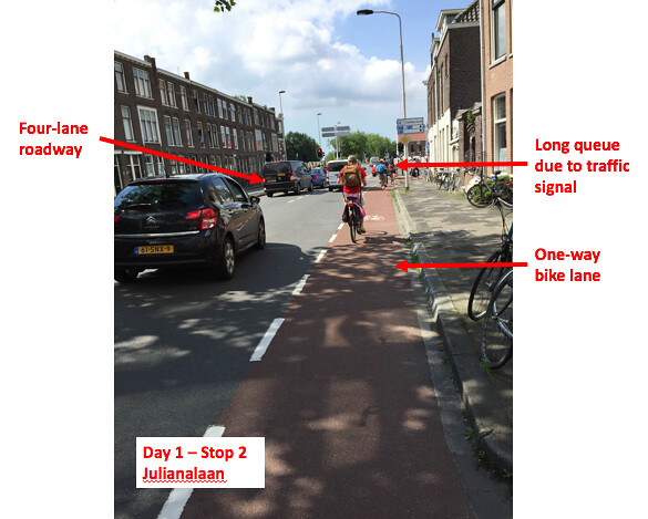
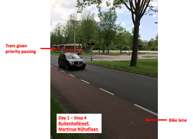
While bike lanes do provide a defensible space between bicyclists and pedestrians, the sensation of a vehicle traveling next to you is still very evident. This is especially intimidating as a cyclist on roadways with a higher volume of vehicular traffic, such as that shown on Figure #2 with two lanes of vehicles adjacent to the bike lane. This makes me wonder if prohibiting bike lanes on roadways with a certain ADT or number of lanes might be a beneficial policy. Cycling in the bike lanes in areas with lower vehicle volume, such as that shown at Figure #1 near a school zone is significantly different as there is more of a gap between passing vehicles and the vehicles are traveling at slower speeds. It was also interesting to note the change in elevation and color of the asphalt at the school zone. Figure #3 shows the use of roadway encompassing one bike lane, one vehicle lane, and then a tram in the center where the tram is given priority passing at the intersections. While bike lanes do not fully protect bicyclists from vehicles, striping pavement would probably be a very cheap option to design and implement on roadways. The main design constraint for bike lanes would be the lane width, which seemed to be fairly standard on the routes traveled below. On more heavily traveled roadways a wider bike lane or a buffer space between the bike lane and vehicular travel lane would definitely be desirable to increase safety and comfort of cyclists.
Figure 1: Stop 1
Figure 2: Stop 2
Figure 3: Stop 4
Quietway
The quietway (Figure #4) was extremely peaceful and easy to cycle along as there was no vehicular traffic in the surrounding area. At first the dashed center line seemed somewhat unnecessary as the only users I observed on the boulevard were cyclists, but then I noticed a business along the route with parking. This quietway was a route of meaningful length that allowed vehicular traffic, but deterred through traffic by using a one-way for passenger vehicles at the end. The roadway therefore became a route for local vehicular traffic only but allowed through cyclists. This made me wonder if this roadway would be more suited for advisory lanes, but a quietway is utilized for roadways with a minimal amount of traffic and advisory lanes are better suited for those with a higher amount of traffic. Also, due to the historic nature of the roadway there were probably space constraints on the roadway width.
https://flic.kr/p/JMcSQf
Figure 4: Stop 7
Cycle Tracks
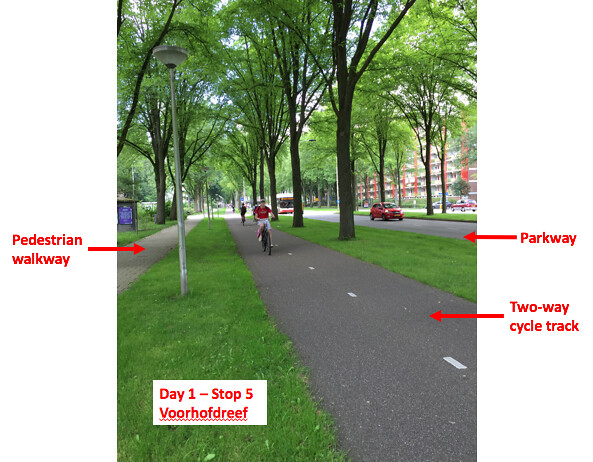
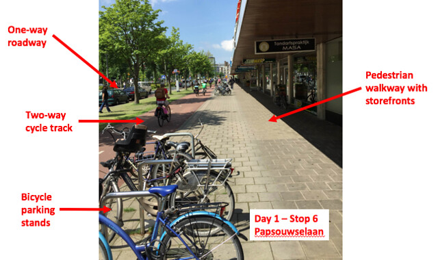
The main point to note regarding cycle tracks is the difference between one and two way cycle tracks. Benefits of one-way cycle tracks are that they allow for better transitions at endpoints and are better suited for complex intersections. Two-way cycle tracks have the benefits of needing less space, have more of a path feeling, and if the road is difficult to cross the users will turn it into a two-way cycle track regardless. Regardless of which type of cycle track it is, a cycle track requires some sort of physical (vertical) separation from a vehicular roadway. One thing I observed was a cyclist was that I felt much more at ease the further away from the vehicular roadway I was, and particularly enjoyed cycle tracks with large vertical separation, such as trees. Some of the cycle tracks were placed far back with rows of trees between the roadway and the cycle track, while others were only a few feet away and separated by the curb and some grass. The one way cycle track shown at Figure #6 showcases how a one way cycle track allows for easy vehicular movement. The vehicle shown had just made a left turn and was idling in the queuing area while the cyclist passed. This, along with the elevated roadway curve at the turn, allows for more visibility of the cyclist from the vehicle’s perspective as well as a refuge place from the vehicular traffic in the roadway. The refuge from oncoming traffic is key for the vehicle as drivers are less likely to accept a questionable gap between pedestrians and cyclists since it no longer fears being rear-ended by oncoming traffic. Aside from this, as a user on a one-way cycle track I did still feel some friction from the traffic. These cycle tracks make a cyclist feel more like a part of the moving traffic alongside them, and therefore it felt like I had to move faster to keep up with the vehicular traffic. One thing I did like about the one way cycle track, however, was that until the intersections I had little-to-no interactions with other users so it felt like I had my own protected space to ride in. The two-way cycle track at Figure #5 felt like more of a path as opposed to the one way track, required far less space along the side of the roadway, and was therefore probably cheaper to design and implement. The only drawback to this was when bicycle and moped traffic needed to pass one another but there was oncoming traffic from the other lane. A benefit of two way cycle tracks is shown at Figure #7, where there are various storefronts along the side of the roadway. A two-way cycle traffic is ideal here, as shoppers would not want to cross the street and make two left turns in order to go to a store they had previously passed so they would instead go against any cycle track that was only one way or ride in the pedestrian walkway. A key design challenge for two0way cycle tracks is again the width of the track, as groups of cyclists traveling together prefer to ride alongside one another rather than in a straight line. Each lane of the cycle track should be wide enough for two cyclists. Also, a wider lane helps to resolve the issue of cyclists and motorists trying to pass one another.
Figure 5: Stop 5
Figure 6: Stop 10
Figure 7: Stop 6
Advisory Lanes
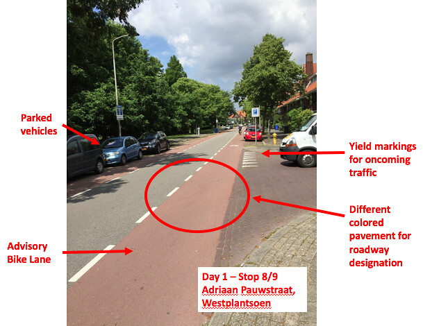
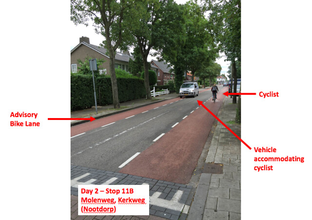
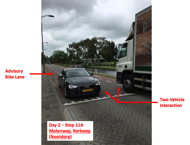
The concept of advisory lanes itself is extremely interesting due to the fact that the lanes do not hold any actual standing, but rather act as “suggestions” for vehicles and cyclists. Similar to bike lanes, advisory lanes are a cheap option since they only involve altering the pavement. This treatment works well for smaller, local streets that need to utilize roadway spacing for parking, such as the scenario shown at Figure 8. The classification of the roadway is clearly shown by the different colors and types of pavement for each class of transportation (vehicle, bicycle, pedestrian). The even smaller local street also has its own type of pavement to differentiate from the roadway with the advisory lanes. This photograph also shows the use of “sharks teeth” to designate who has to yield to oncoming traffic. It’s clear from this example that the bicycles are given priority in this area over vehicles, making advisory lanes ideal for local roads with a low volume of slow moving traffic. A similar design is shown at Figure #9, where one vehicle is moved to the opposite side of the roadway from a cyclist. Figure #10 shows a situation where two vehicles are going in opposite directions along the roadway and have to slow down to accommodate one another. The roadway on this stop seemed to be a bit more congested than the other examples as it led directly into the town square and had several trucks along it, so perhaps this specific treatment is not ideal there. Also, riding from stop 11A to 11B was slightly challenging as a cyclist because advisory lanes are not a good treatment at intersections. The intersection I encountered was confusing as a cyclist has there was no clear right-of-way. While it’s Dutch custom that the vehicle or cyclist to the right of you has the right-of-way, it still seemed somewhat confusing as a user and could result in vehicle-bicycle conflicts.
Figure 8: Stop 8/9
Figure 9: Stop 11B
Figure 10: Stop 11A
Bicycle Highway
The feel of a bicycle highway was similar to a very removed cycle track as there was no sense of pressure from nearby vehicles. The only conflict points are other cyclists and mopeds coming from the opposite direction or trying to pass one another in the same direction. The main design constraint for bicycle highways is finding the space to put them in as they often go through parks in removed areas from main urban centers. This particular stretch also had a depressed area that went underneath a highway to further avoid any vehicle interactions which would probably be expensive to construct after the highway had been built, but would be easy to implement during the initial highway construction.


Leave A Comment