Assignment 4: Delft Bicycling Facilities: Jaguar Ashtiani
Bike Lanes
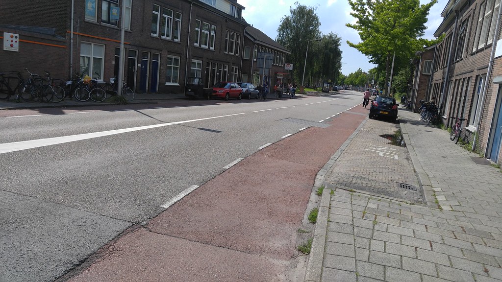
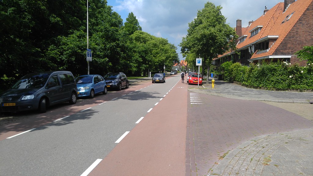
Nassaulaan (Fig. 1)
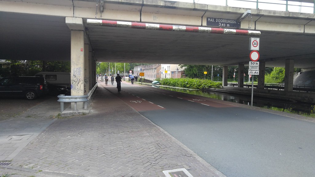
This street was not very busy, although there was a bus line that ran along this road but it didn’t seem to come very often. I thought this was a pretty good use of an advisory bike lane. There was one light that controlled a crosswalk; I found this to be a major nuisance. Pedestrians shouldn’t need a light to cross a 1+1 road that doesn’t have very much traffic to begin with. Although I am sure the light was there for a reason, I think that it could be removed without being a hindrance to pedestrians. Perhaps just putting a yield sign and sharks teeth would be better than a traffic light. I felt safe along this road, except for at the traffic light which I believe makes stopped cyclists vulnerable to traffic approaching from behind. I thought this was a pretty good use of space in the road. As for expense, road paint and red asphalt can’t be very expensive. This facility is minimalist but still accomplishes what it is meant to.
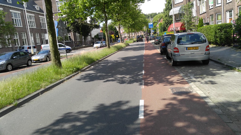
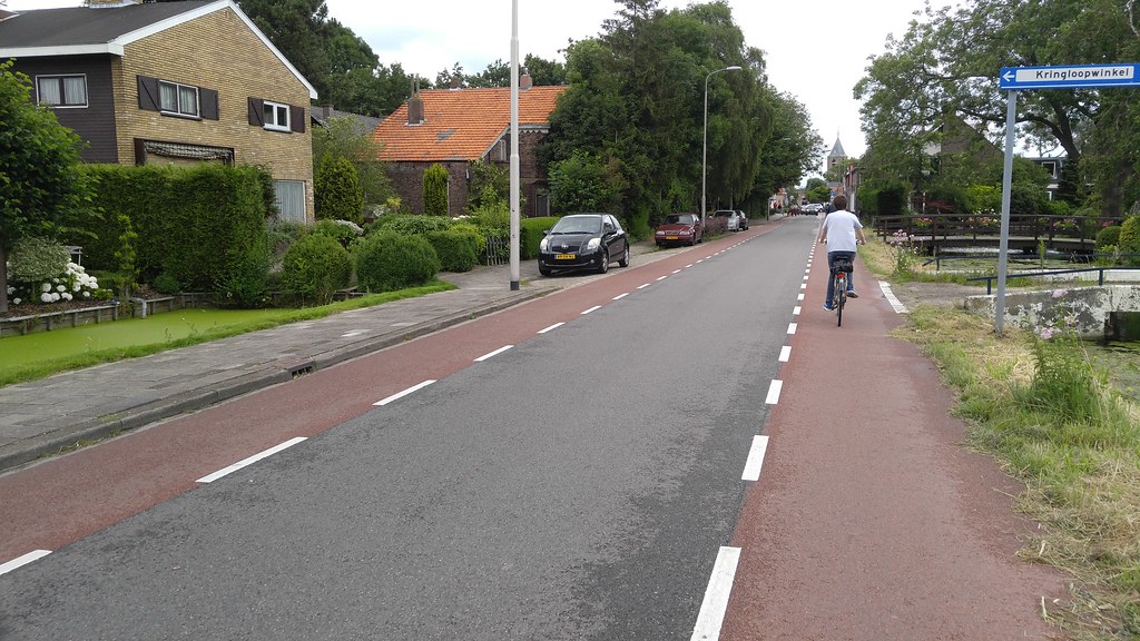
Julianalaan (Fig. 2)
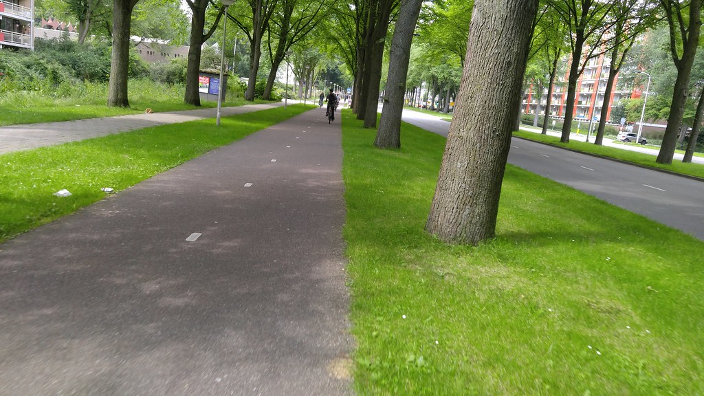
This street was busier than the last (Nassaulaan) and it was separated by a physical median, unlike the other street. Due to the parking at the side of the street cyclists run the risk of getting doored. The median also makes it so that cars cannot move over partially into the oncoming lane to give any cyclists extra room. Although this street was prettier, I think I preferred cycling on the other street; there was less parking, less traffic, and traffic could move over and adjust to give more room.
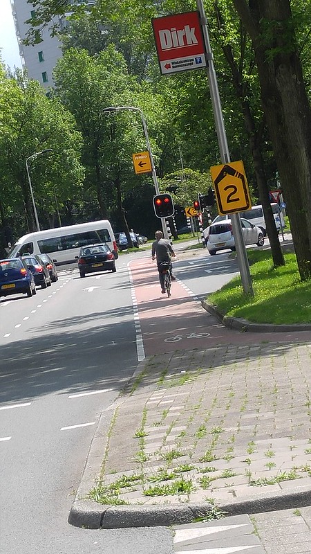
Buitenhofdreef, Martinus Nijhoflaan (Fig. 4)
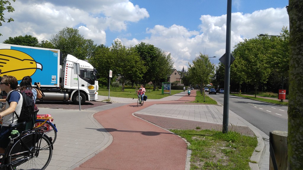
I do not like the pocket bike lane but this intersection was kinda funky so there may not be a better way to accomplish this. The pocket lane is dangerous because cyclists run the risk of getting hooked since they are in the blind spot of right-turning drivers. A protected intersection would have been better but may not have been feasible with the current layout of the roads.
Bike Boulevard
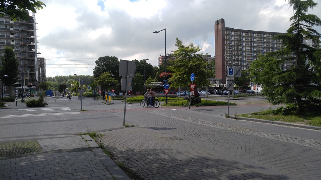
Abtswoude Path, TU to Pr Beatrixlaan (Fig. 3)
I thought that this was a very well done facility. Cars had to yield to crossing bike and pedestrian traffic, so the only thing the bikes really had to worry about was the tram, and the intersection had audio and visual warnings to let riders and pedestrians know when the tram was approaching. I felt safe biking along this path. I thought it was a good use of space and can’t be very expensive to maintain. I also thought it was incredibly safe how far back cars had to stop when at a light. They stop quite far from the pedestrian and bike crossing points and far from the traffic inside the intersection. I like this more than how the United States does intersections. If traffic comes to a stop but overshoots the stop line, they likely still won’t end up inside the intersection, a danger to cars crossing the intersection.
Buitenwatersloot (Fig. 7)
I thought this was a great facility that was very pleasurable to ride. There was extremely little car traffic, and the bus didn’t come through very often, so it was low stress. This was definitely my favorite segment to ride during this assignment. It was an incredible use of space, and the demotion was a good way of moving car traffic to the road that was specifically built to handle the added capacity while still making great use of the road that was already there/
Cycle Tracks
Voorhofdreef (Fig. 5)
This was another great use of space and another pleasurable ride. The bikes were separated from motor vehicle traffic by a nice grassy median and trees; there was practically zero stress. This was a better use of space than just adding another lane of vehicle traffic and perhaps just demoting bike traffic to a bike lane. This facility, along with all the others, likely isn’t expensive to maintain at all.
Papsouwselaan (Fig. 6)
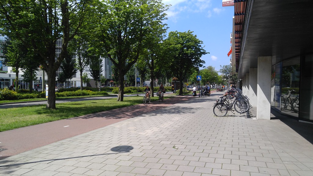
I thought decreasing vehicle traffic from two lanes each way to one each way was weird because it removed street parking and likely took some business away from all those businesses lining the street. However the cycle track was very nice and likely would have negated the impact that removing street parking may have had on those businesses. The trees provided a nice shade and this was very low stress except for the occasional scooter rider who would whiz by. Even though it removed street parking, this is likely a better use of space. If not that, it is at least more aesthetically pleasing.
Ruys de Beerenbouckstraat (Fig. 10)
The raised crossing was very cool, and I felt very safe using it. The cars cross the path at a right angle so they can see cyclists in the path and those about to enter the crossing; no cyclists are in their blind spots. They also have enough space to yield without blocking traffic so they do not feel pressured to proceed across the path even if it may not be safe. This is likely more expensive than a level crossing because of the excess materials needed but I believe the safety upgrade definitely necessitates it. This was a great facility that I appreciated using.
Advisory Lanes
Hugo de Grootstraat (Fig. 8)
I am not a huge fan of the advisory bike lanes but I understand their place. I honestly think they’re no different from sharrows, and just end up using more paint than them while accomplishing the same thing. Advisory bike lanes are great on one-lane one way streets and streets with incredibly minimal traffic, but the streets I saw them on had higher traffic than I expected them to have and were usually two way, and it caused some awkward interactions with drivers and bikes. I don’t think I could say I felt unsafe in advisory bike lanes, but there were some times where a car got uncomfortably close to me because another car was coming from the opposite direction. It would be a better use of money to just paint sharrows or even not use any markings at all. I understand that advisory bike lanes have a psychological effect on drivers but I think drivers know to give space when there is a cyclist present already. This street in particular had street parking on both sides so cyclists still run the risk of getting doored.
Westplantsoen (Fig. 9)
Same could be said about this one. This street was fairly busy, and the street parking adds the risk of cyclists getting doored. Again here, I believe sharrows or even no markings would accomplish the same thing. Drivers and cyclists generally know how to adapt to traffic and I don’t think these advisory bike lanes do much other than perhaps reinforcing that with drivers and cyclists.
Molenweg (Fig. 11)
This was probably the best use of advisory bike lanes I saw because this road had less traffic and no parking, although even still there were some short stretches of time where there was quite a bit of vehicle traffic going in both directions at the same time. I saw some cars get very close to my colleagues and end up practically on their tales because the cars had to move over to make space for another oncoming vehicle. This no doubt adds stress to the cyclist since they had a car very close behind them, but also likely adds stress to the driver because he has to deal with driving behind a cyclist who at times can be unpredictable. This problem could be solved if vehicle traffic were to give some extra space in front of them to cyclists. Of all the bike facilities I saw on this tour, I was least impressed with the advisory bike lanes.
Bike Highway
N470 Bike Highway (Fig. 14)
I liked this crossing a lot more than those that go over the highway. This was much lower effort compared to those because there isn’t a large hill to climb. I don’t know much about highway construction but I would perhaps guess it is cheaper to build a tunnel crossing than building a bridge that spans a highway, but I may be wrong. This crossing was also a lot quieter than those that go over the highway since you don’t hear much traffic noise. I enjoyed this crossing a lot and thought it was a good use of space and was likely not too expensive. It is also incredibly safe because bicyclists have priority, there were no pedestrians when we crossed the freeway, and was incredibly low stress. I felt very safe riding this facility.


Leave A Comment